Selected project · LoveCrafts
Hand-made feel.One system underneath.
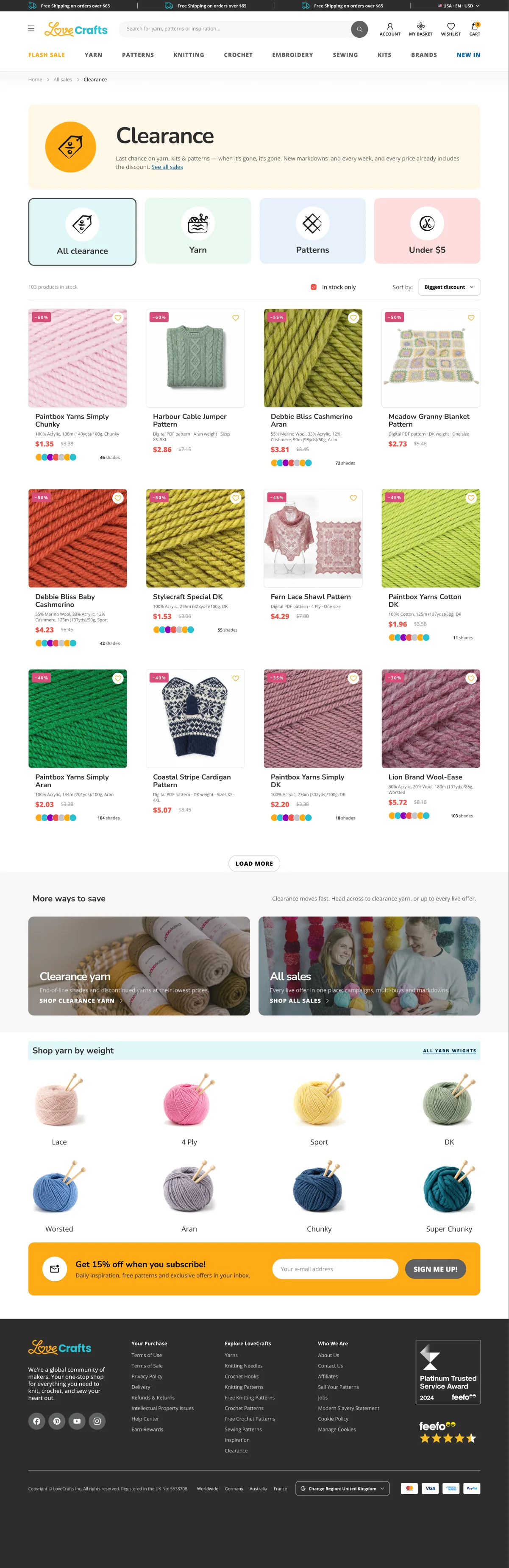
LoveCrafts is an online shop and community for people who knit, crochet and stitch. I designed its department hubs, Clearance, a seasonal home-page widget, the customer account and the community flow, and moved the whole site onto a shared multi-brand design system without losing its hand-drawn character.






The core idea
One hero, every department
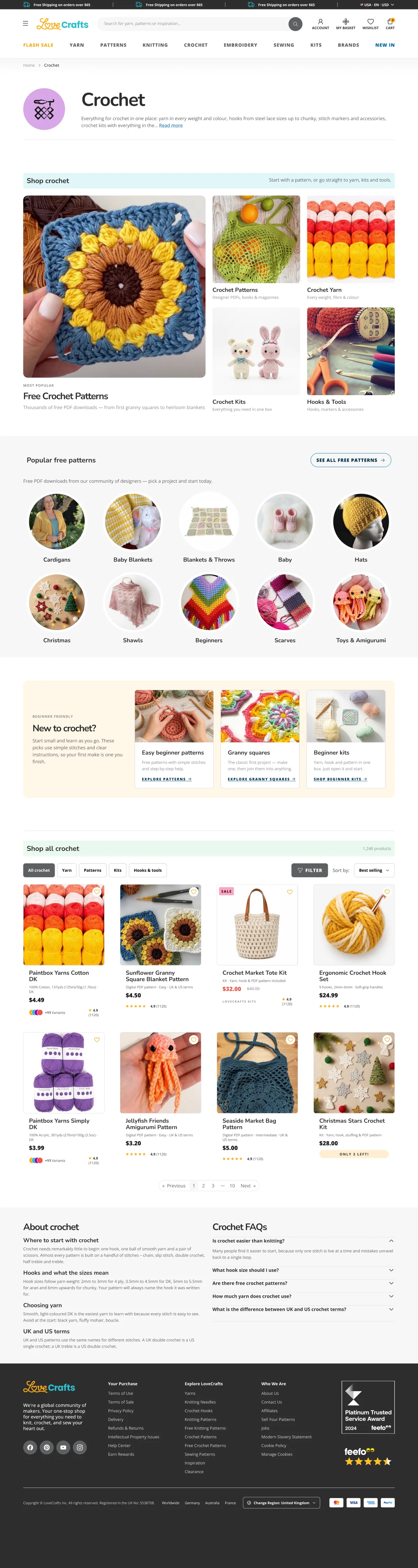
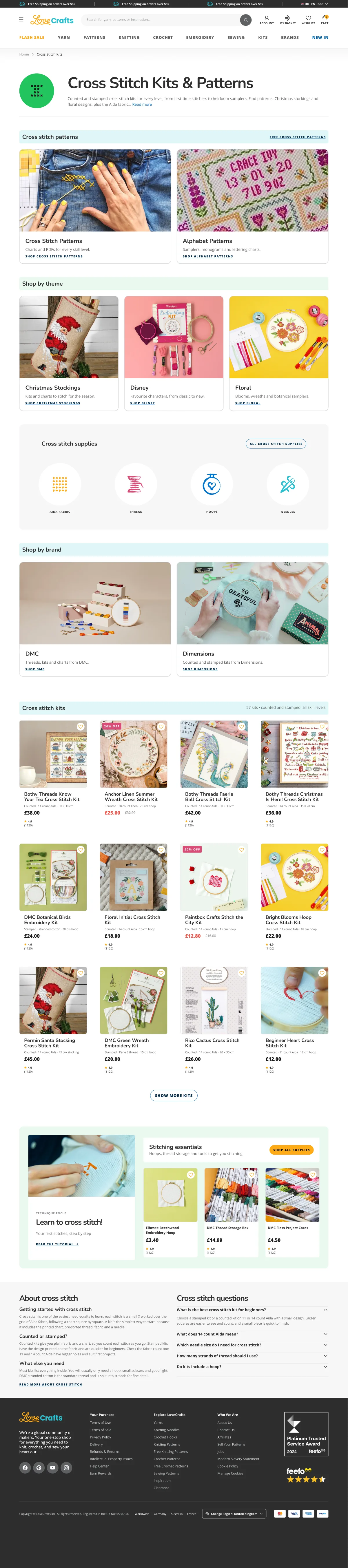
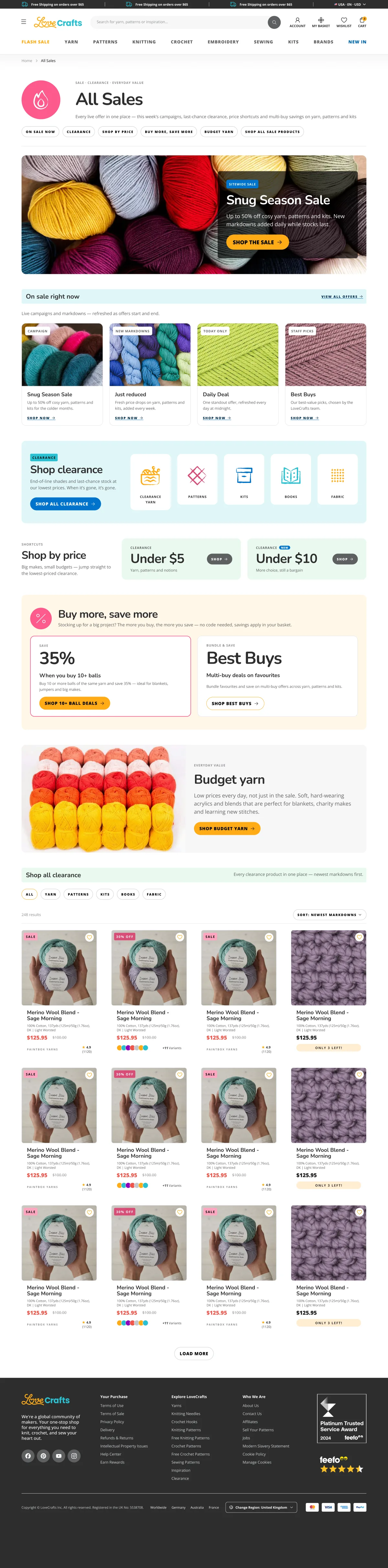
Every hub and listing opens with the same Category intro. Its colour is not a variant: it comes from a Hero Accent mode, so the circle, the icon and the tint bar change together. A new department colour is one new mode.
Yarn
Every yarn we stock, by weight, fibre or brand: from luxury merino to everyday acrylic… Read more
Hero Accent mode
- 1 component
- 8 colour modes
- 0 colour variants
Department hubs
Hubs that sell and teach
Each department gets its own section rhythm: no two neighbouring sections share a module, on desktop and on mobile.

Home-page widget
One widget, every season
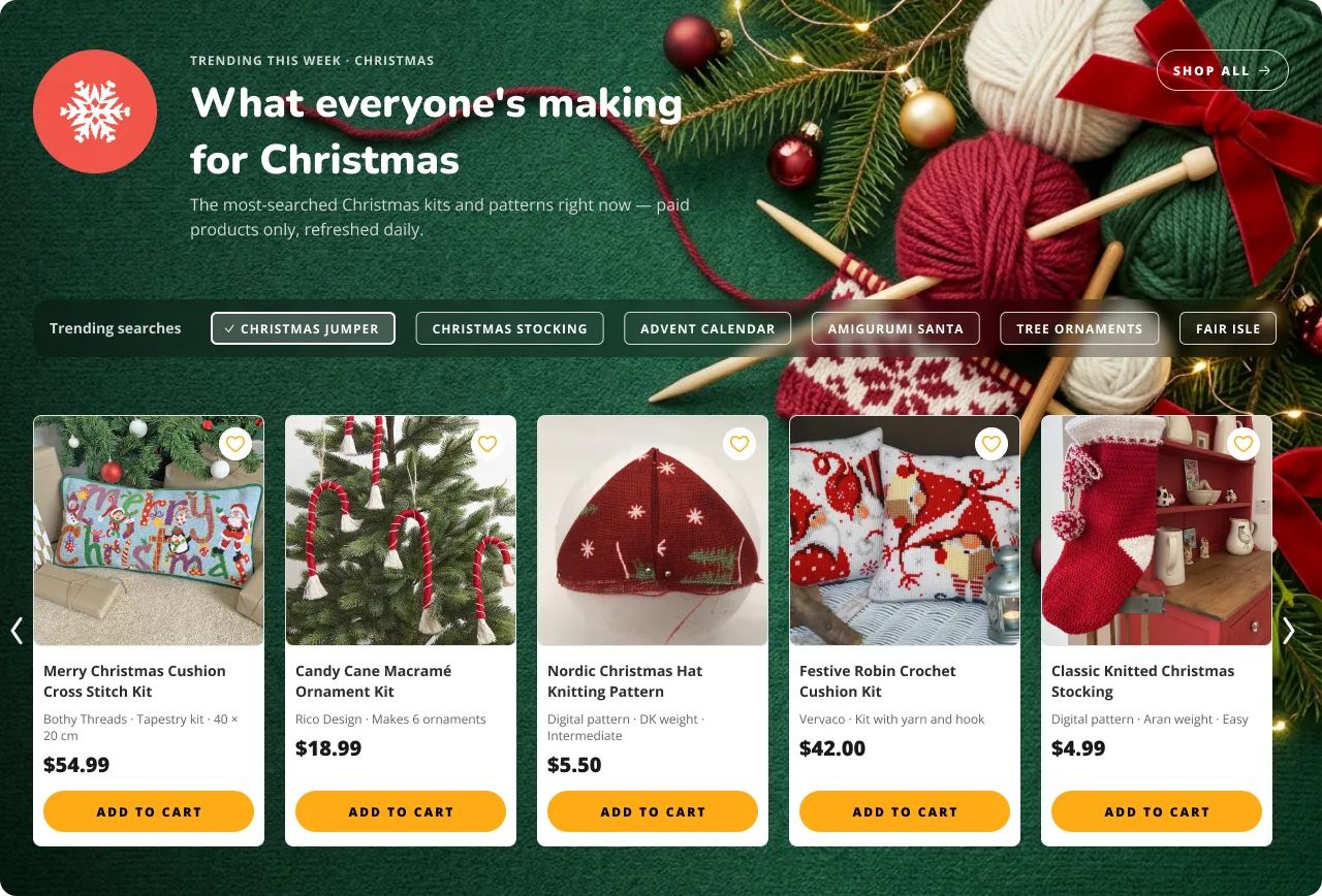
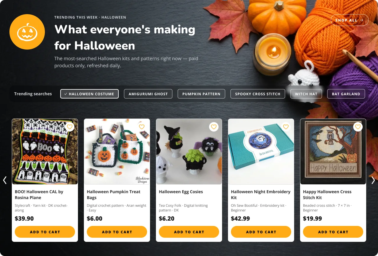
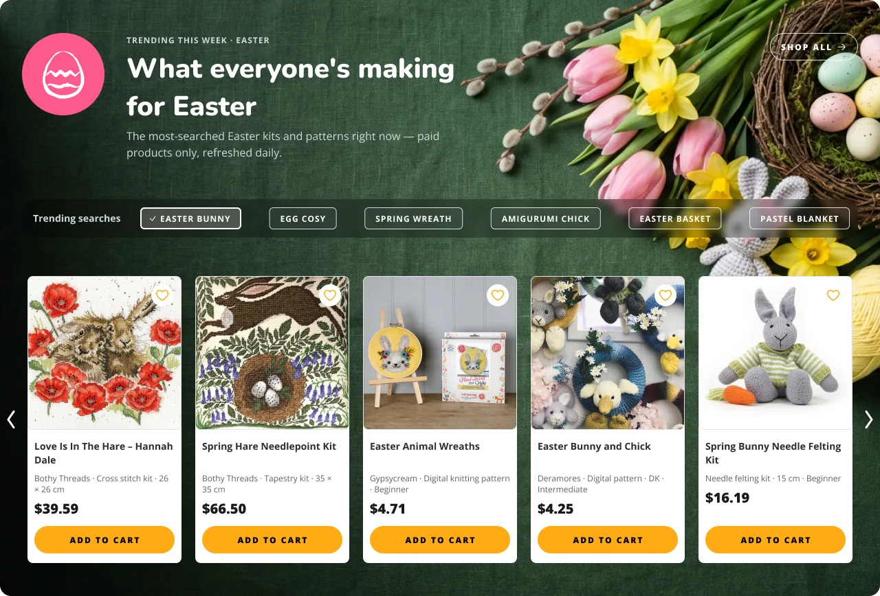
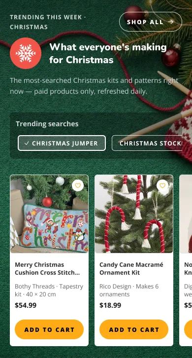
A “what people are making right now” block that follows the calendar. The layout never changes; the photo, the seasonal icon, trending searches and products do. A flat overlay on the text side keeps the heading readable on any photo.
Ready for the rest of the year
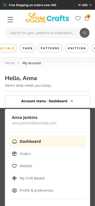
My account
An account that starts with what needs you
The dashboard answers “what needs me?” first: a late parcel, an order on its way, the latest pattern. Every block has its own empty, loading and error state, and a failed service never pretends to be empty.
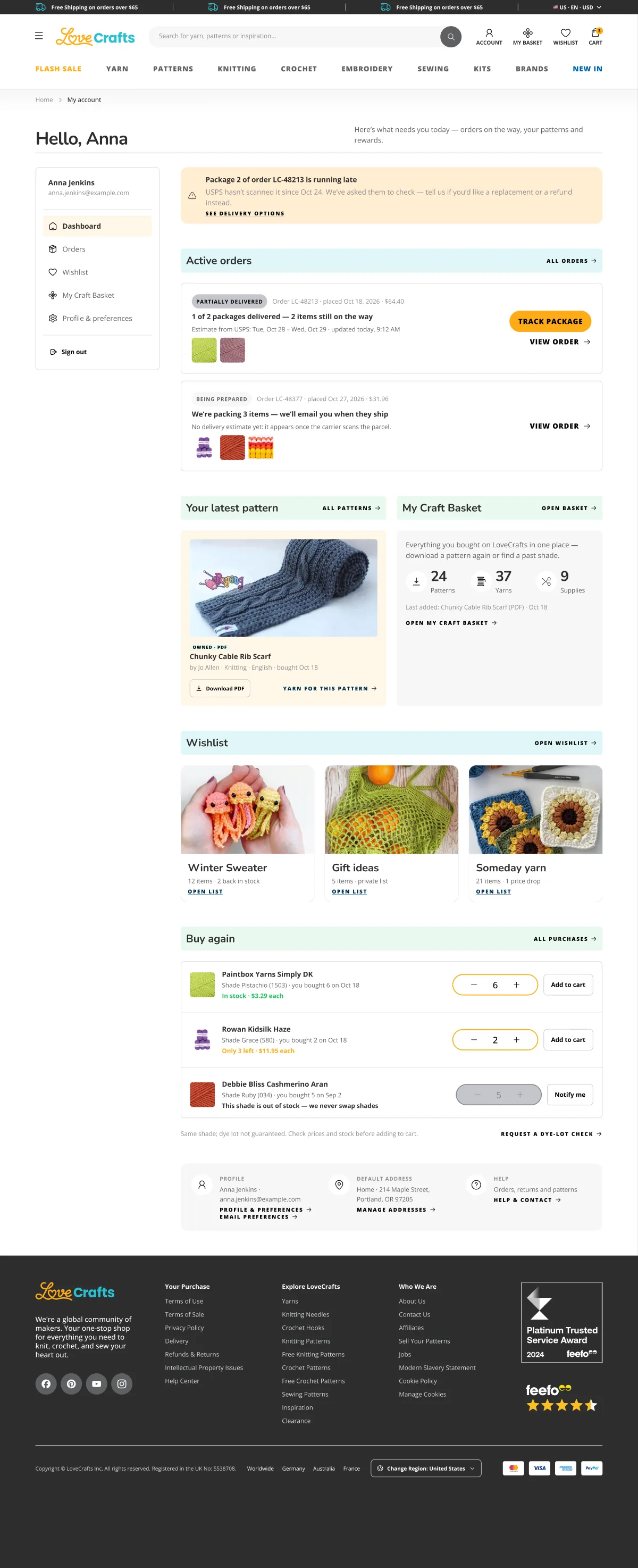
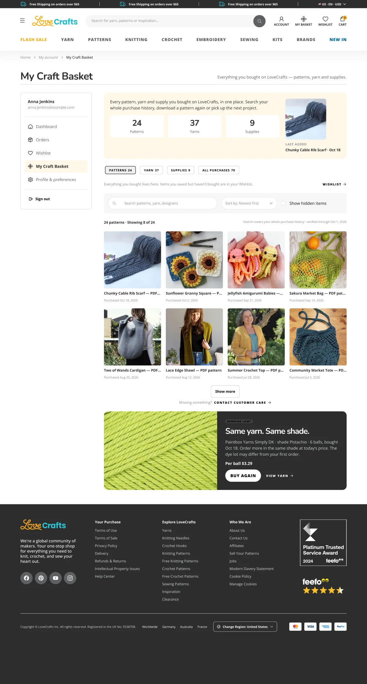
- 1A late parcel comes first
- 2Active orders, with the next step
- 3Latest pattern, one tap to download
- 4Buy again in the same shade
- Empty
- Loading
- One service failed
- Long titles
- Missing images

Community
From inspiration to a finished make
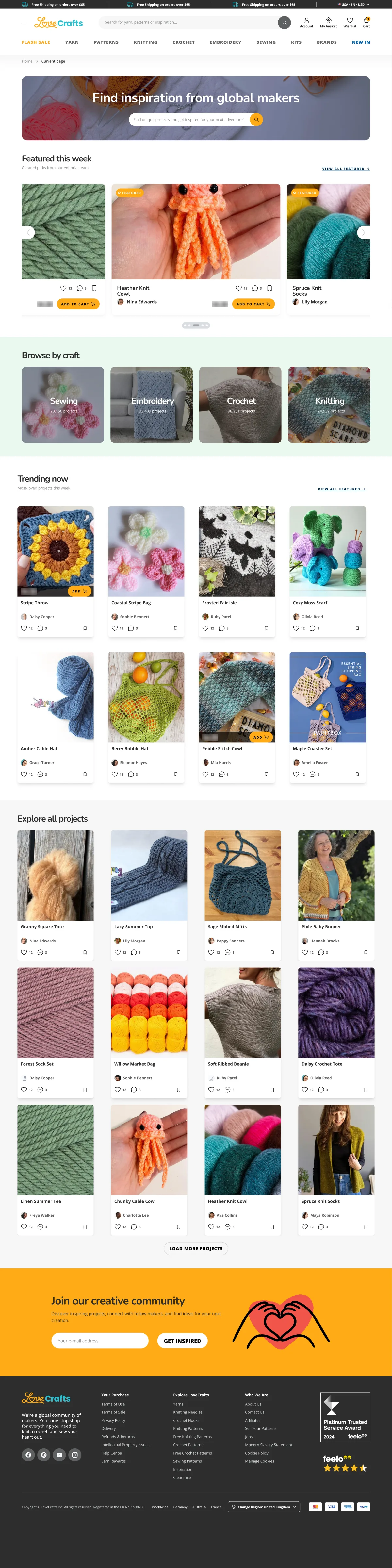
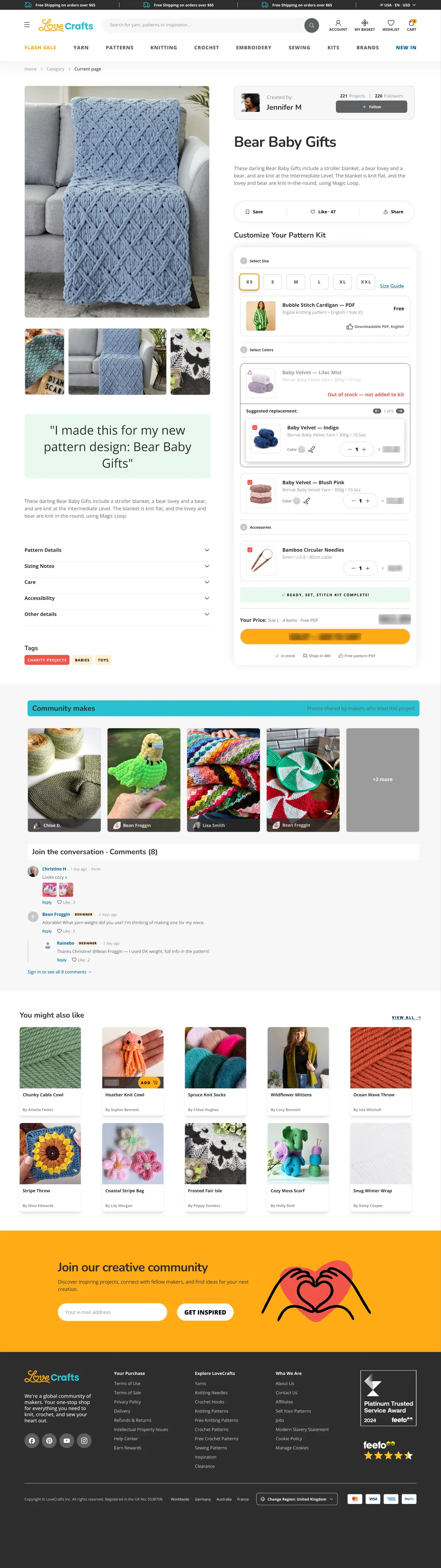
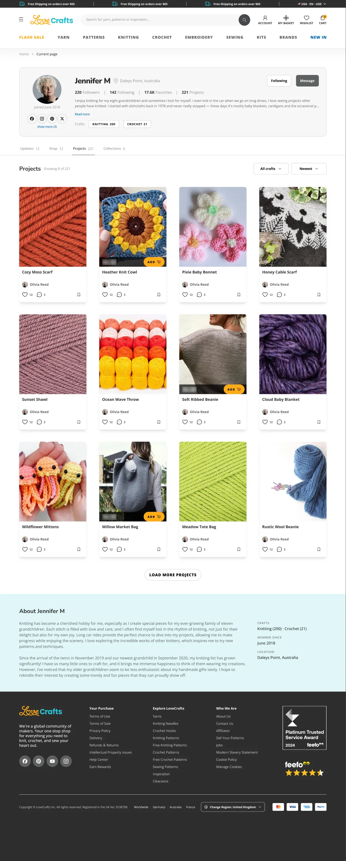
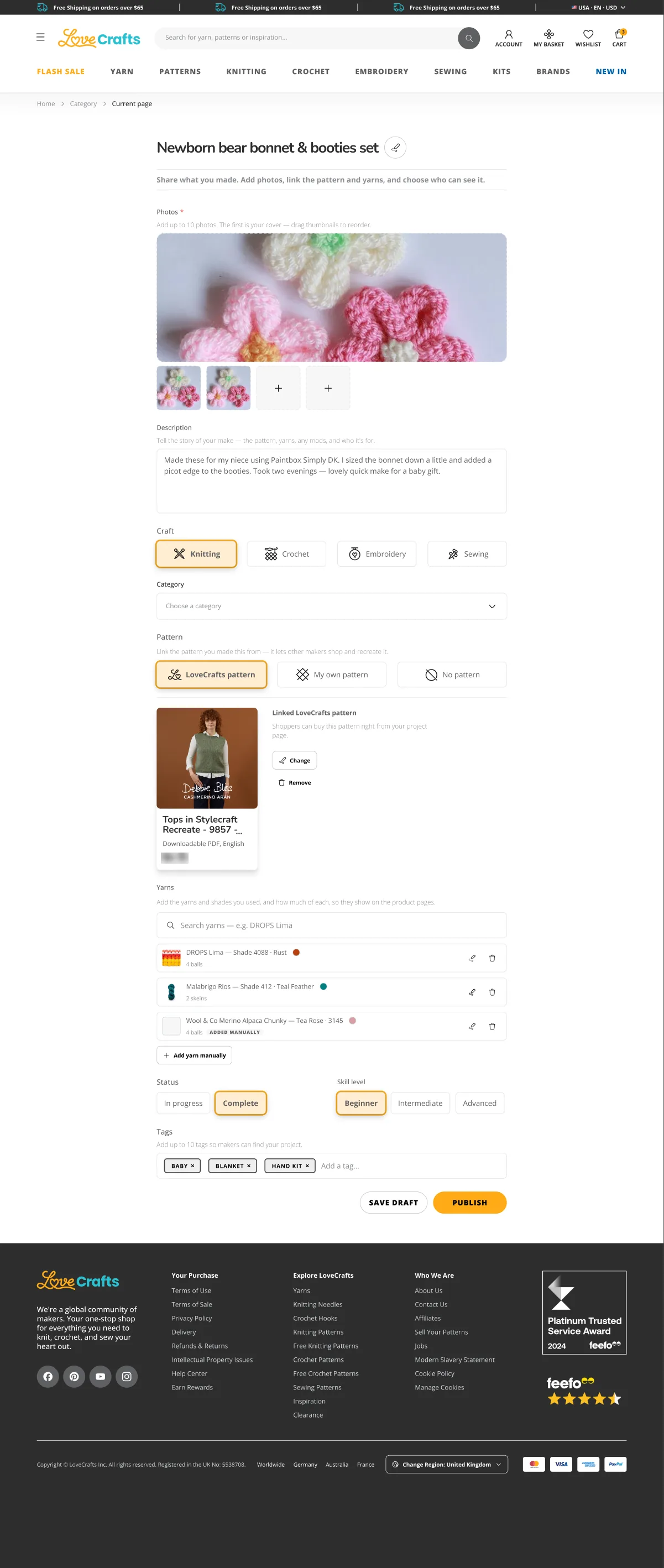
Makers share what they made and link the pattern and yarn, so other makers can buy the same kit in one step. I redesigned the flow around that loop.

Mobile
Its own rhythm, not the desktop squeezed
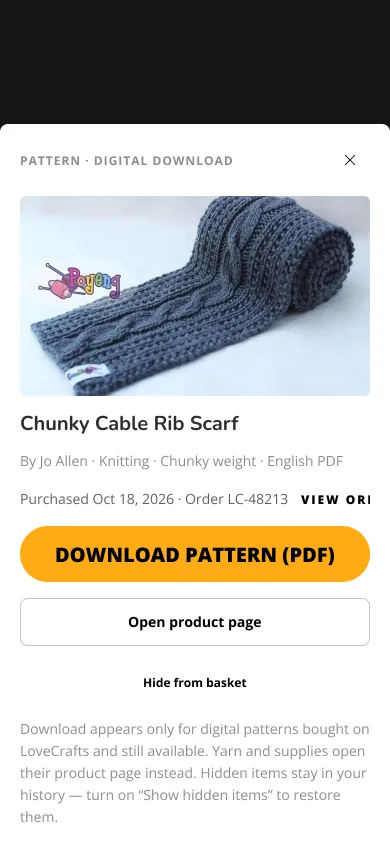
Grids become swipe rows, filters and item details open as sheets, and every hub has its own section order on a phone.

Small moments
Illustrated for the in-between
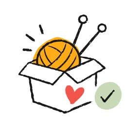
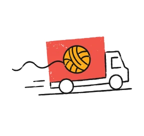
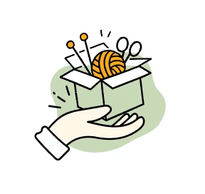
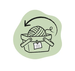
A family of 48 spot illustrations covers the moments nobody plans for: an empty search, a failed payment, a parcel on its way. One line, one sage blob and LoveCrafts amber, on the site and in e-mails.
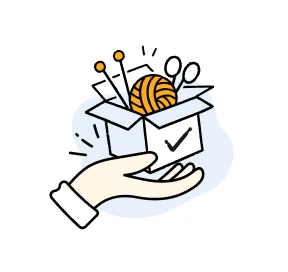
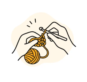 Empty state
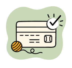 Payment successful
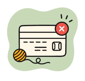 Payment failed
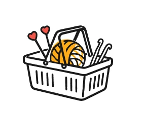 Basket reminder
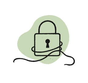 Password reset
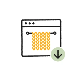 Pattern download
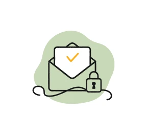 Verify e-mail
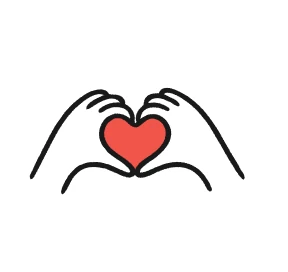 Welcome
Decorative icons
Drawn with a brush, used as a system
Navigation, hub tiles and heroes use 87 decorative icons drawn with one brush: a single stroke, never a filled shape, so the colour comes from a token and the line keeps its hand-made edge. Each icon ships at 48, 80 and 144 with its own stroke weight.
One brush, three weights
One icon, any colour token
Before the new pages
Seven ways to open a page, now four
An audit found seven different page intros, three of them on the same kind of listing. Each was mapped to one of four documented types.
- White title + divider→ H1
- Icon circle intro→ H1
- Tinted plate→ H1
- Photo with dark panel→ Banner
- Video + text→ H3
- Photo + text on tint→ H3
- Bare utility title→ H4
- H1Category introHubs and listings
- H3Media splitBrand and kit pages
- H4Page titleSearch, cart, order status
- —Campaign bannerHome and campaigns
Key decisions
- 01
Shared parts from the shared system
Buttons, inputs, chips and carousels come from the multi-brand system. Only truly LoveCrafts parts stay local.
- 02
Colour is a mode, not a variant
One hero component takes its accent from a mode list instead of a set of colour variants.
- 03
Busy pages get a quiet hero
Hubs open on white; modest listings get the tint bar.
- 04
Errors never look empty
If a service fails, the account says so. Never “0 orders”.
- 05
Fixed cards, flexible rows
Product cards keep one size per breakpoint; rows spread and names truncate.
- 06
Rhythm on every page
No two neighbouring sections share a module, on desktop and on mobile.