
Selected project · Robert Kaufman Fabrics
One storefront.Two audiences.
A website redesign for a family fabric house in business since 1942. Quilters browse it for inspiration; wholesale shops use it to order. They now share the same pages: when a shop logs in, the public site becomes a trade storefront.
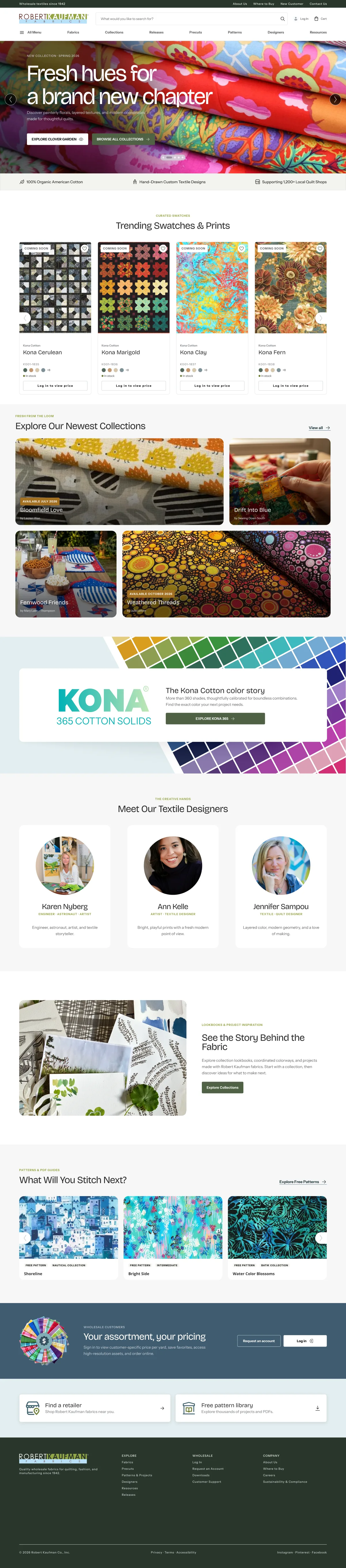
Logged out: an editorial fabric catalog.

The challenge
Two very different visitors, one dated split
Quilters come to be inspired by fabrics, collections, free patterns and designers. Shop owners come to work: they check stock, order bolts by the dozen, reorder and download catalog images.
On the legacy site these audiences were split. There was a public catalog and a separate “Customers Only” area with about 20 flat menu items, a giant inventory table, and downloads hidden in another portal.
- A fabric-first, editorial public site
- Real online wholesale ordering
- Order a whole collection in one go
- Show inventory in context, not in a table
- Make Resources a first-class section
- Overview
- Address Book
- Inventory Availability
- Permanent Out
- Future Releases
- Product Images (ZIP)
- Product Images (Dropbox)
- PDF Flipbooks
- + 12 more links
The core idea
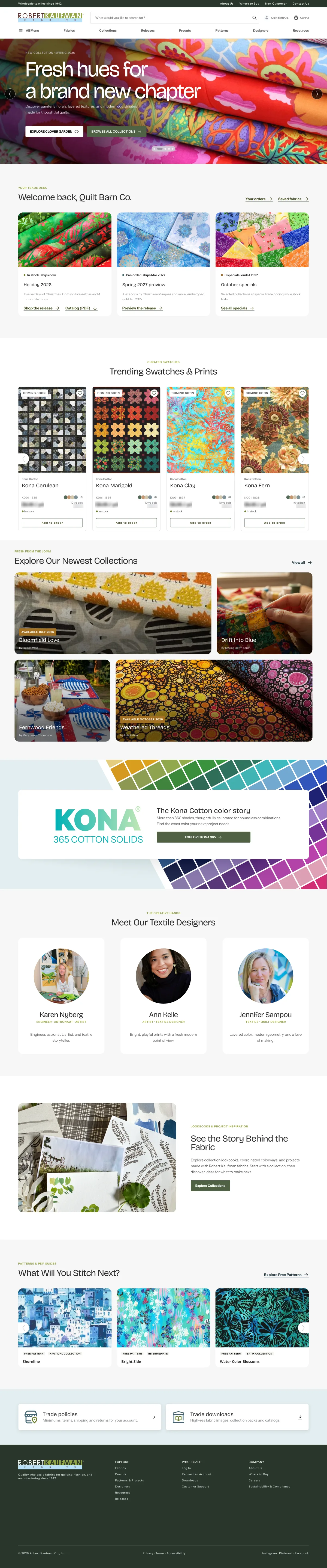
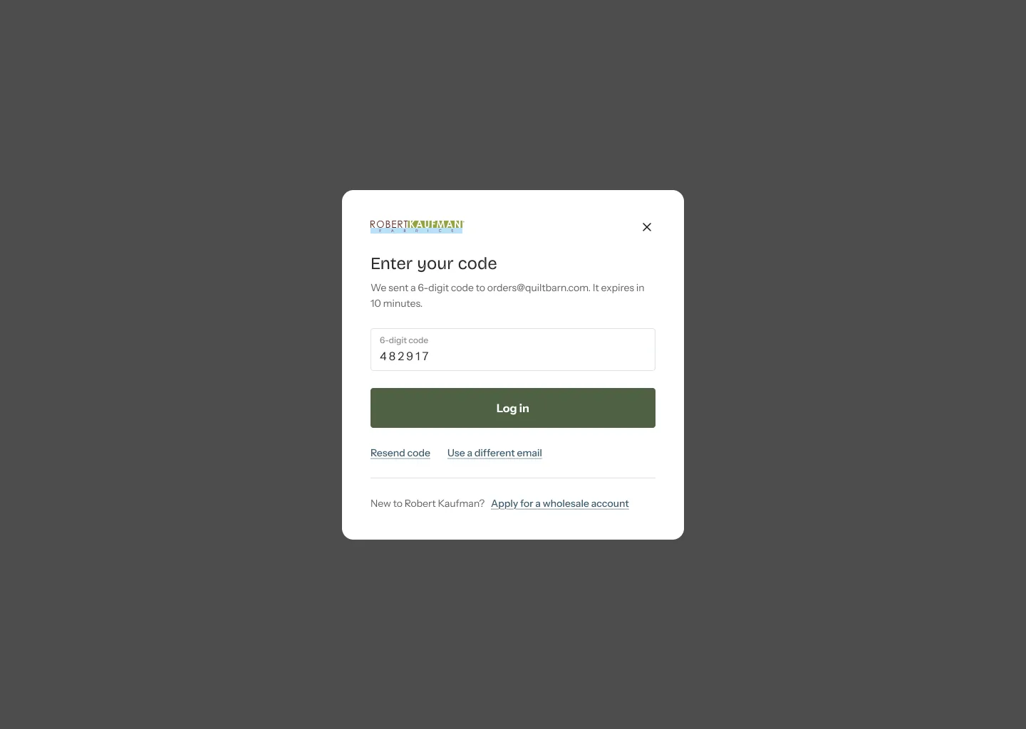
Trade-enabled on login
There is no second portal. Once a wholesale customer signs in, the same page gains prices, availability, bolt quantities, “Add to order” and trade downloads. That means one information architecture, one design system and one set of templates, each with two states.
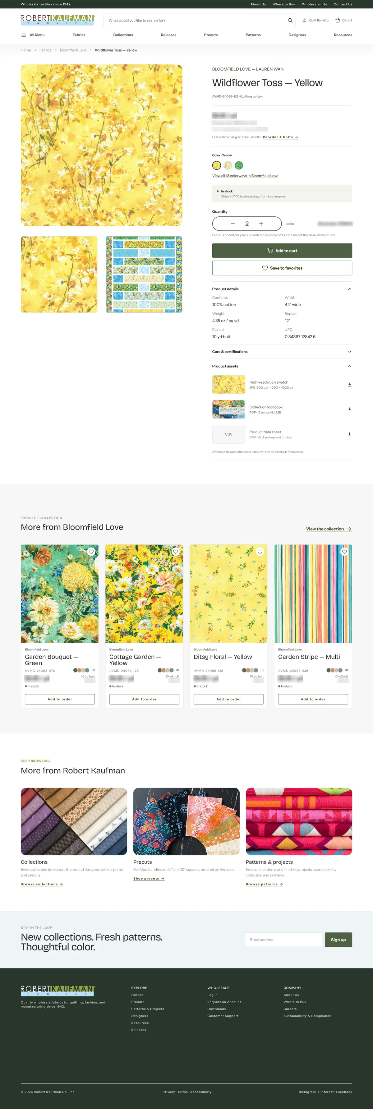
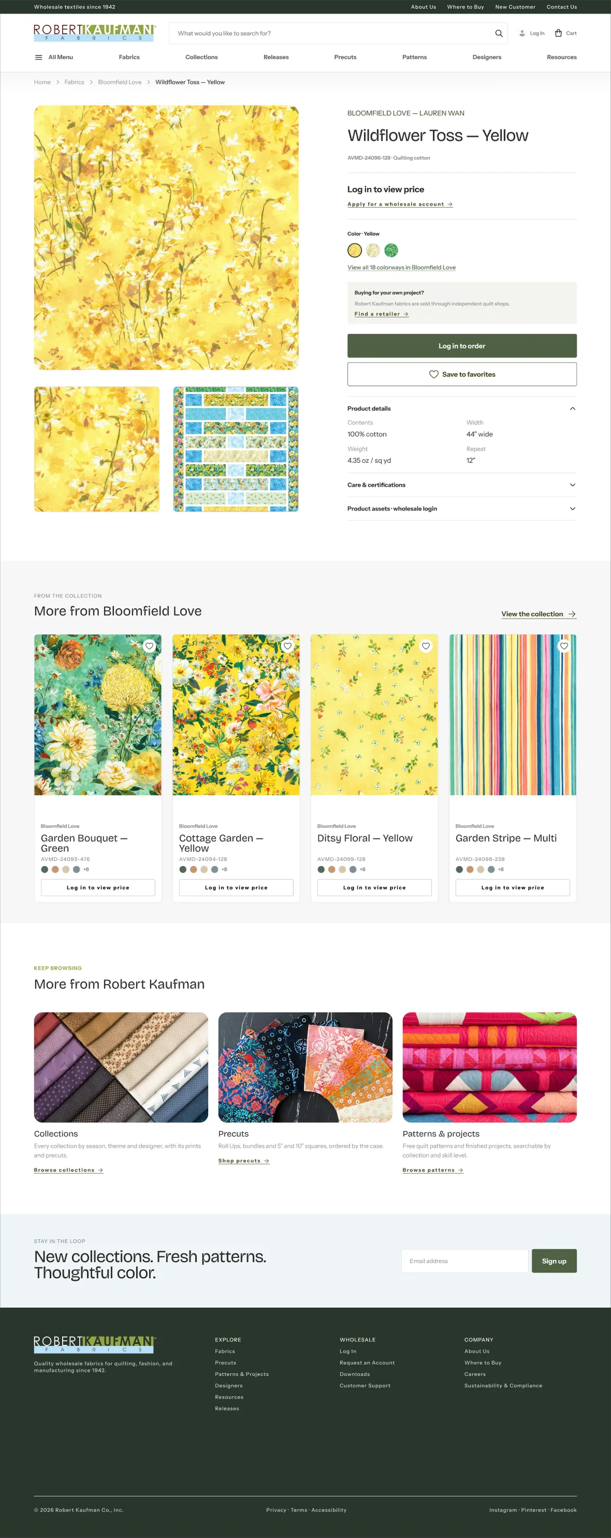
Drag to compare
Process
From audit to a 96‑screen prototype
- 01 · JulAuditLegacy site walkthrough, brief, analytics alignment
- 02 · SepCommerce coreFabrics, PDP, collections, cart
- 03 · SepReleases & resourcesSeasonal releases, image assets, catalogs
- 04 · Sep–OctPatterns & precutsPattern detail with Kit Builder, precut packs
- 05 · OctTrade accountDashboard, orders, invoices, quick order
- 06 · OctDiscovery & supportSearch, Where to Buy, company pages, 404
- 07 · OctQA & responsiveMobile pass, widescreen, prototype wiring
Workflow
AI as a design partner
I ran the project with Claude Code connected to Figma as a second pair of hands, working from a written rule book for the project. I made the design decisions. The agent did the heavy lifting:
Every AI output passed screenshot QA before it reached a review.
- Built and edited frames through the Figma Plugin API, with tokens bound to every layer
- Ran programmatic audits: 1,150 instance heights, card-row gaps, duplicate photos
- Wired 3,063 prototype links by script, Public and Trade starting points
- Ran an analytics-alignment audit that moved priority to interior templates
- Generated icon comparison playgrounds and hero art candidates for me to choose from
- Mirrored the design system to code, generating tokens.css from the 789 variables
Key screens
Fabric-first, editorial, restrained
Hover a page to scroll it
Homepage
Editorial entry: trending swatches, new collections, the Kona color story, designers.

Fabrics landing
A storefront landing (curated modules + SEO) kept apart from the working list.

Collection · Trade
All colorways with stock, bolt pricing and “Order this collection”.
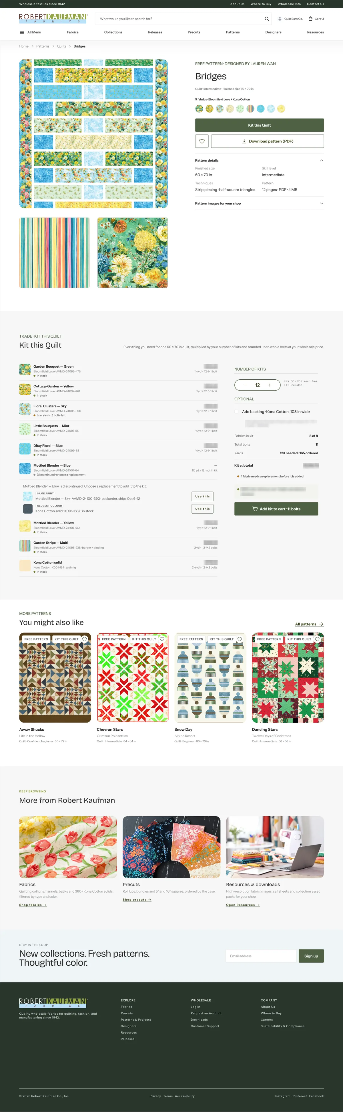
Pattern + Kit Builder
A free pattern turns into a ready-to-order fabric kit.
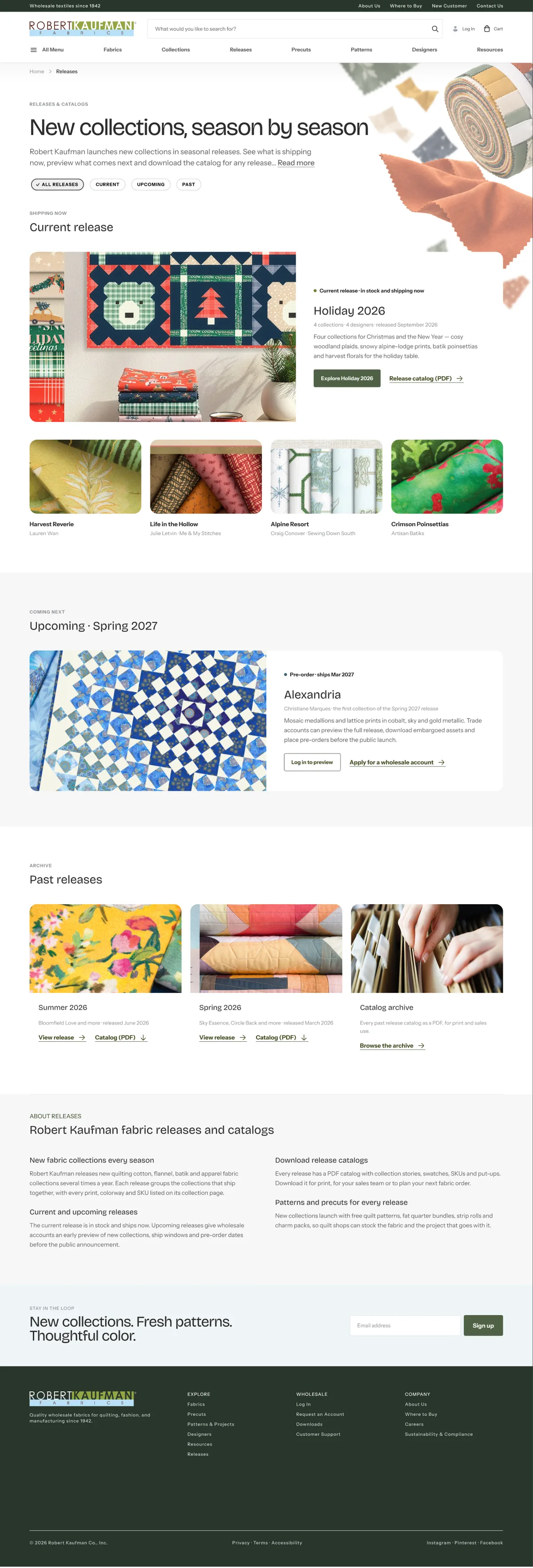
Releases
Seasonal releases with an “Upcoming” state for trade customers.
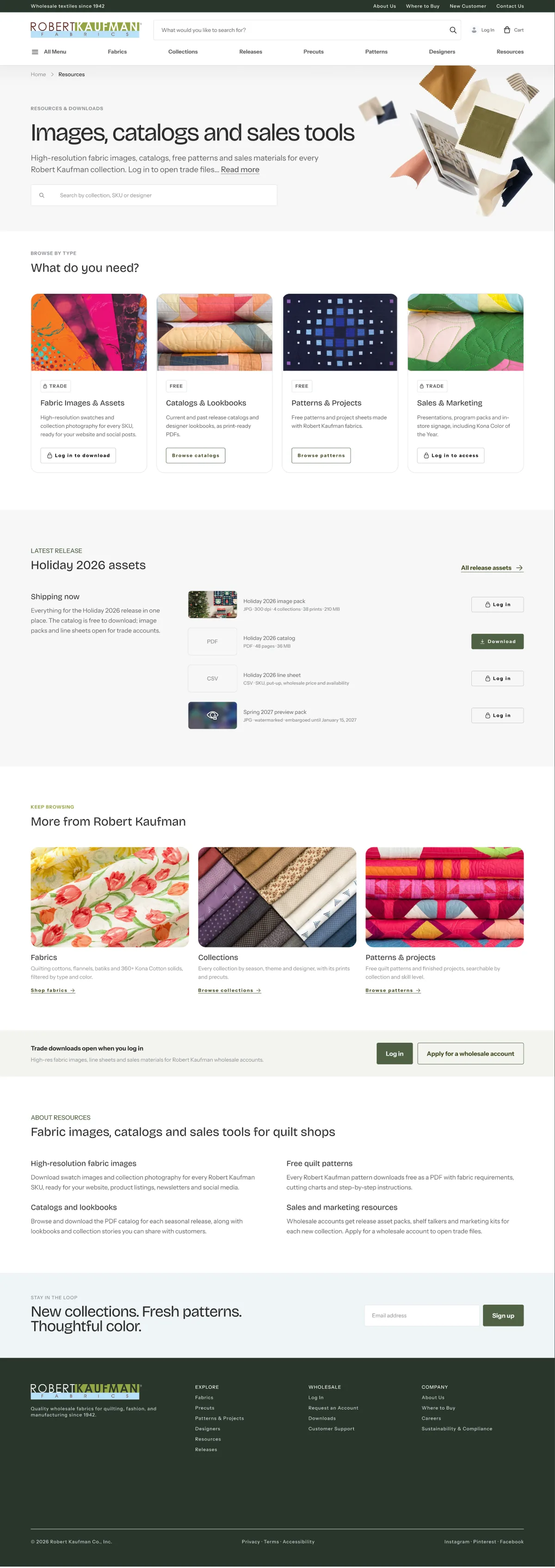
Resources
Catalogs, lookbooks and fabric image assets as a first-class section.
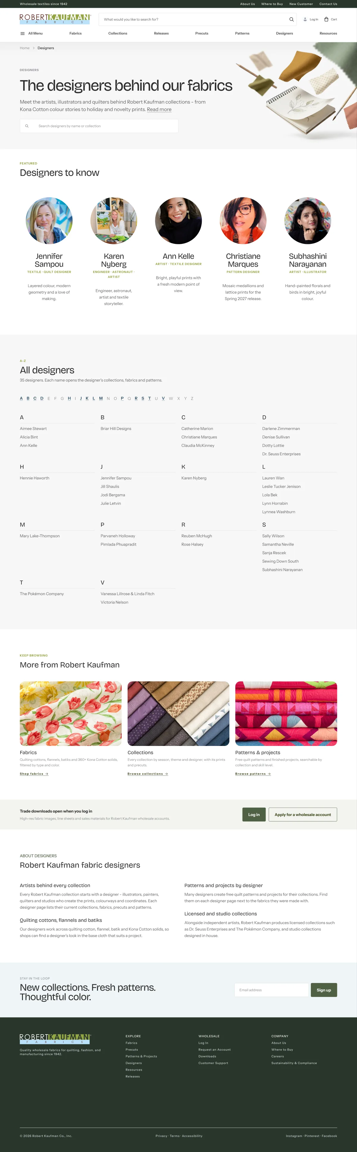
Designers
The people behind the prints, linked to their collections.
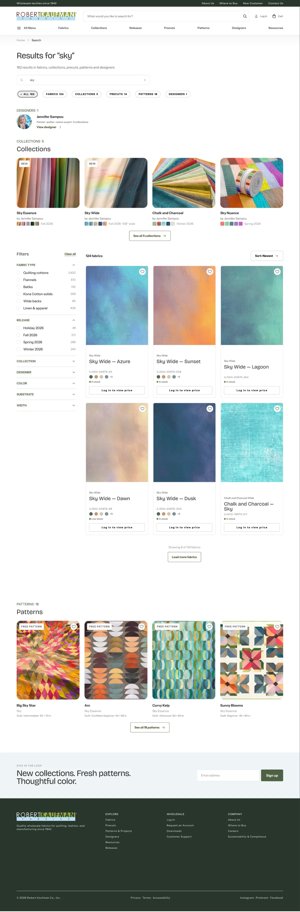
Search results
Fabrics, collections, patterns and articles in one results page.
Signature flow
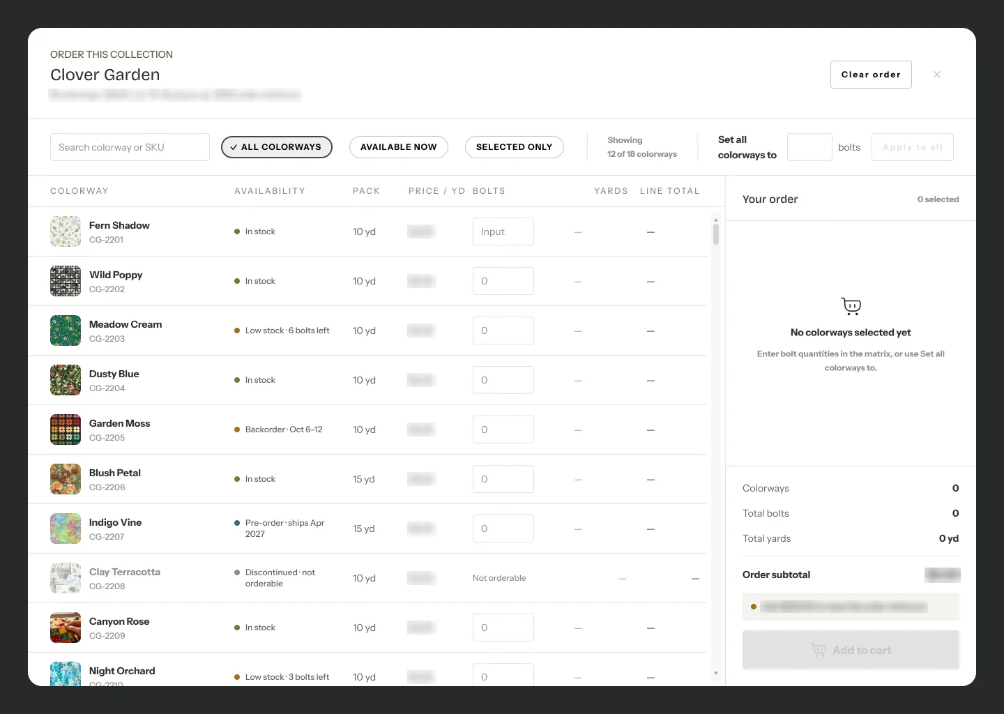
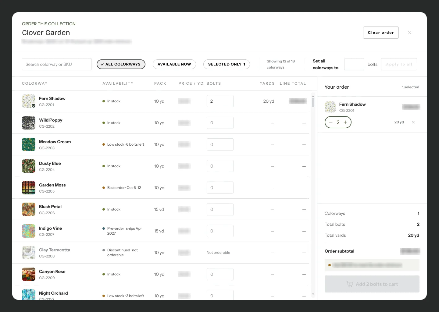
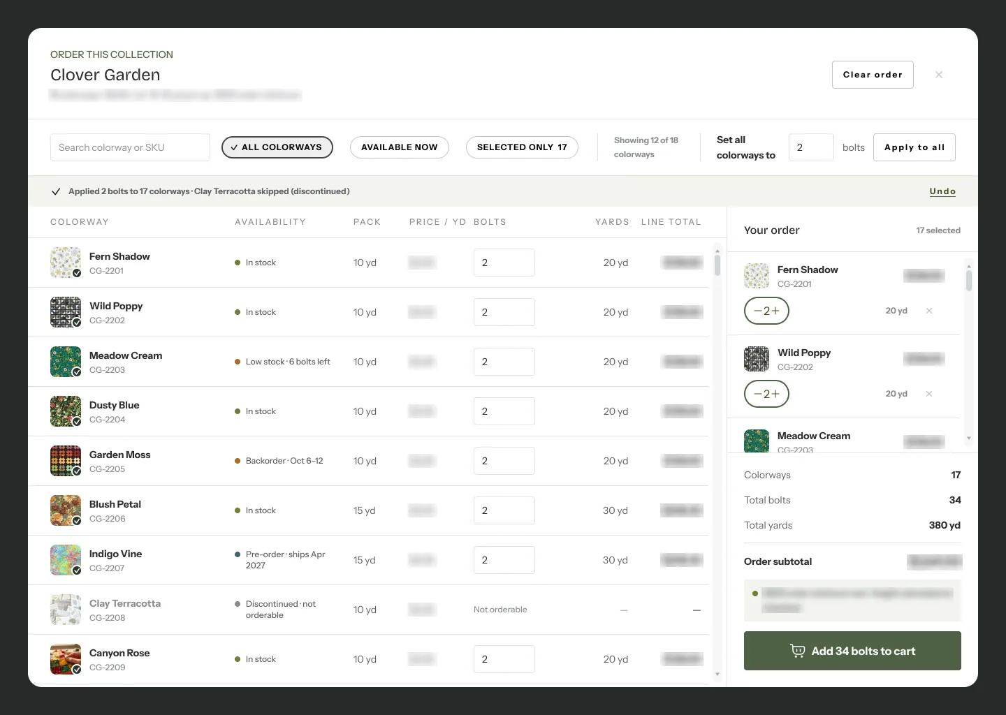
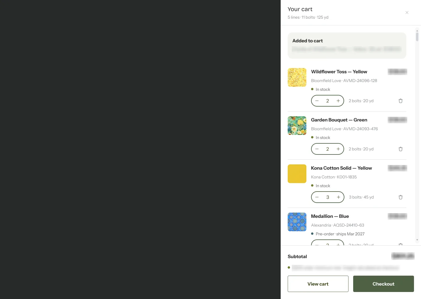
Order a whole collection in one sheet
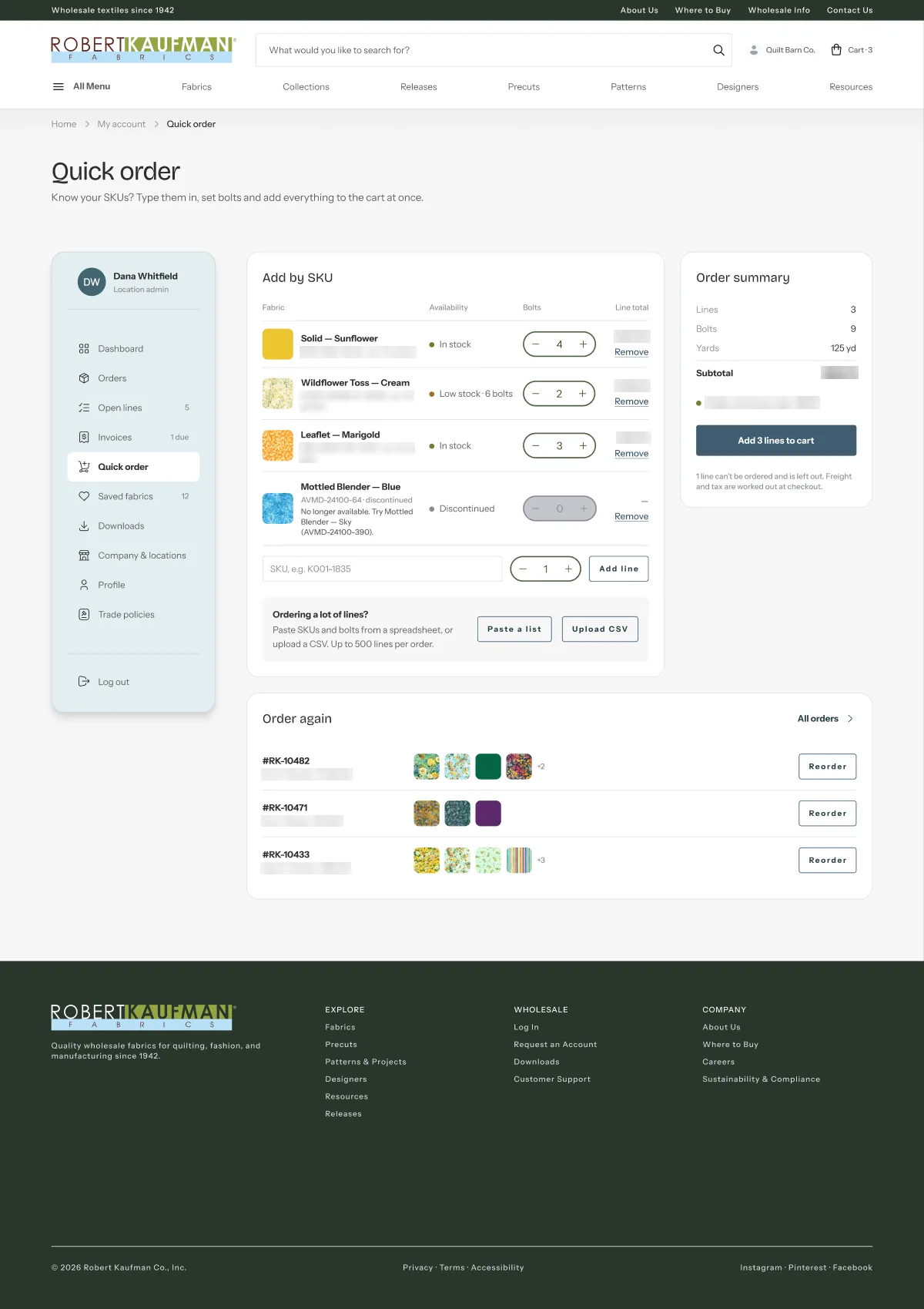
The legacy site needed one form per SKU. The new order workspace lets a shop set every colorway to N bolts in one move. Discontinued prints are skipped automatically, and yards, totals and the order minimum stay in view.
My account
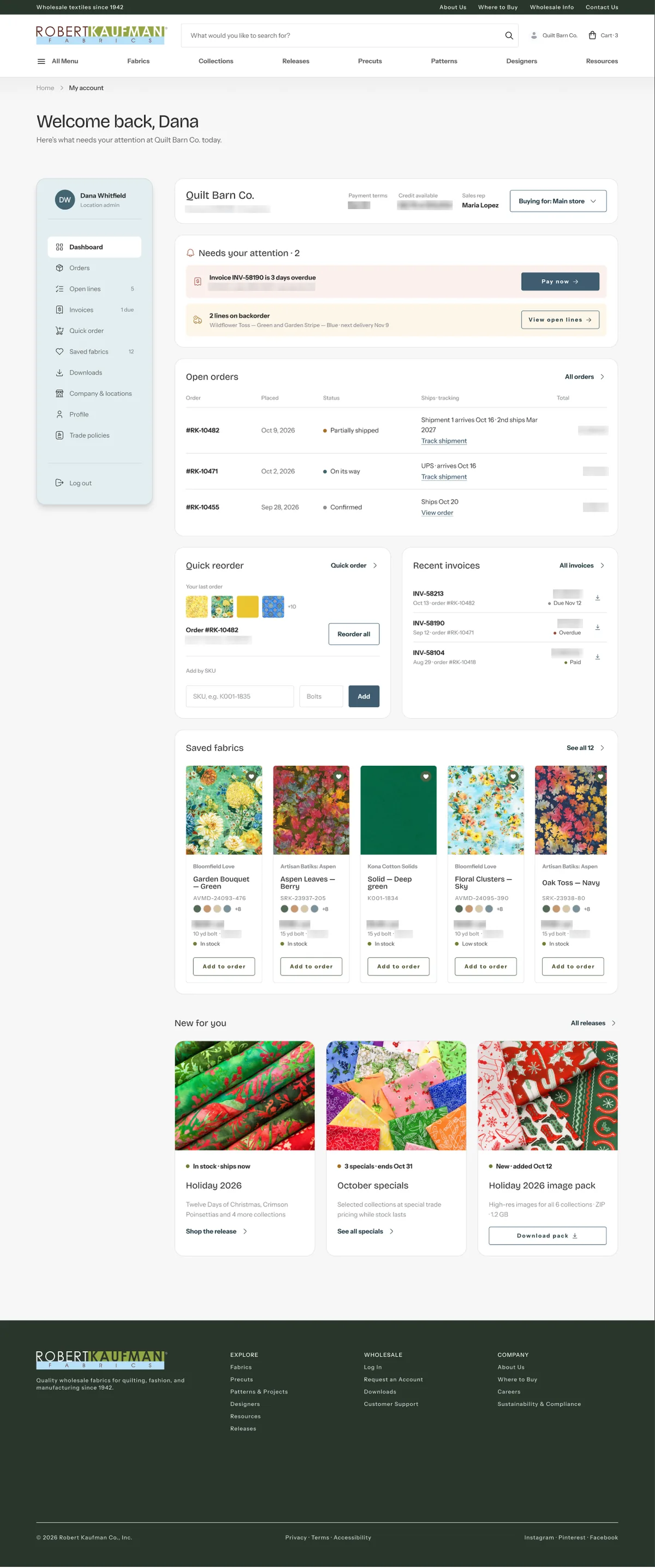
A trade dashboard instead of twenty links
The dashboard answers “what needs my attention?” first: overdue invoices, backorders, open orders. Quick reorder, saved fabrics and new releases follow.
- Dashboard
- Orders
- Order detail
- Open lines
- Invoices
- Quick order
- Saved fabrics
- Downloads
- Company & locations
- Profile
- Trade policies
Design system
A brand layer on a multi-brand system
RK sits on a shared, multi-brand Global design system. I built a dedicated RK token layer with desktop and mobile modes, so one variable carries both values. On top of it sit 21 RK components that use Global parts inside.
Architecture
Typography
Colour
- Ink
#29362A - Olive 700
#4F6245 - Denim
#3F5C70 - Brand secondary
#83AEB7 - Sage
#B1BEA3 - Sky 300
#CDE3ED - Subtle
#F7F7F7
Corner roles · desktop → mobile
08 → 620 → 16Fabric Card · Public
The Fabric Card has one fixed size per breakpoint and a Public / Trade state. A two-line name or a long price never breaks the grid.
Icon library
71 icons on a 24 grid, stroke-only and monochrome, with 12 custom craft icons such as the quilt, fabric bolt and thread spool. The stroke scales with size, from 1 to 3.
Mobile
Its own rhythm, not the desktop squeezed
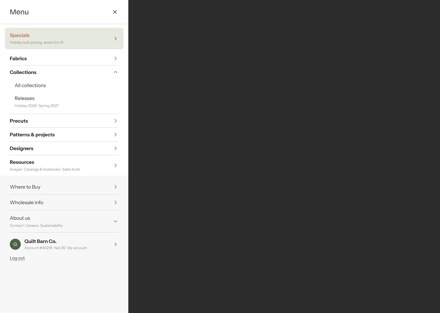
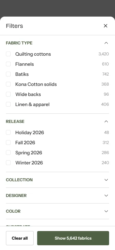
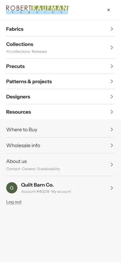
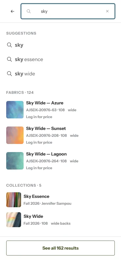
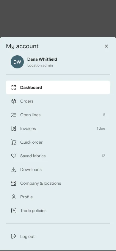
On mobile, carousels and swipe strips replace grids, filters live in a bottom sheet, and the account menu is a sheet too. Every template ships as a desktop and mobile pair.



Art direction
A hero art series: floating objects
Each site section gets one hero image: quilting cottons, catalogs and notions tossed mid-air on white, in a muted sage, ochre and terracotta palette. I wrote the series rules and directed the generations in Figma AI. Text gets a fixed safe area on the left.



Small moments
Empty states with a little life in them
Nobody plans to see an empty search, an empty saved list or a 404, but everyone does. I drew a small illustration system for those moments: a quilter between patchwork blocks built from the RK monogram. In Figma I animated it with a calm 2-second loop where the head tilts and the blocks breathe. Each one is a component with Default and Small sizes and ships to code as SVG + CSS.


Key decisions
- 01
One site, trade-enabled on login
No duplicate portal. Trade adds functionality to the same pages.
- 02
Native checkout, smart cart
Shopify checkout is only branded. RK logic (ships now / later, order minimum, reorder) lives in the cart.
- 03
Landing vs. list
Every content type gets an editorial landing and a separate working list with filters.
- 04
The PDP as the anchor
The fabric page sets the visual language. Pattern and precut details are built from it.
- 05
Geometry that never breaks
Semantic corner roles and fixed-size SKU cards replace hand-picked radii and stretched rows.
- 06
Rhythm rule
No two neighbouring sections share a module, on desktop and on mobile.